ITECH1103- Big Data and Analytics Lab 3 Working with Data Items
{`
  ITECH1103- Big Data and Analytics
  Lab 3 Working with
  Data Items
  Federation University Australia
  `}
Objectives
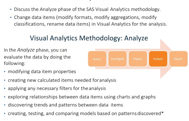
* Creating, testing, and comparing models can be accomplished with SAS Visual Statistics andSAS Visual Data Mining and Machine Learning.
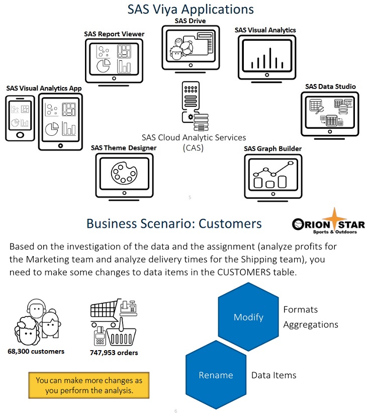
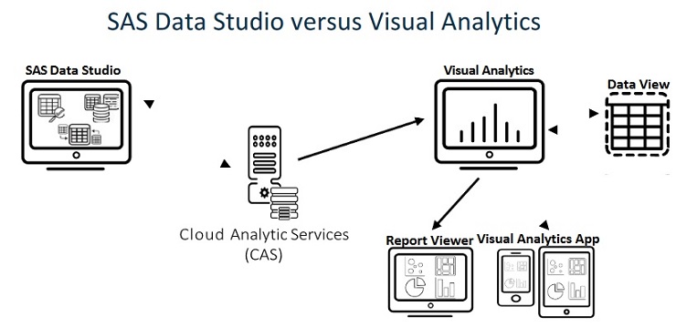
SAS Visual Data Studio uses a CAS table as input and creates a CAS table as output.SAS Visual Analytics uses a CAS table as input and creates a report that can be viewed in the Report Viewer or Mobile BI app. Any changes to data made in Visual Analytics apply to the report only and do not affect the CAS table.Beginning with Visual Analytics 8.3, report data views can be created to save and apply settings for a data source. A data view acts as a template for any settings that are modified, including data property changes, data source filters, hierarchies, geography data items, calculated items, and more. A data view does not update the CAS table. If the view is updated, your reports are not automatically updated with the new settings.Data views are saved separately from your reports. If you create a data view in one report, you can apply it to other reports that use the same data source.Data views can be shared so other users can also apply them to the data source.A data source can have a default view as set by an administrator. You can also set the default view for yourself. A default data view is automatically applied anytime you add the data source to a report.For more information about data views, see “Working with Data Views in Reports” in the SAS® Visual Analytics 8.3: Working with Report Data documentation.
Data Item Properties
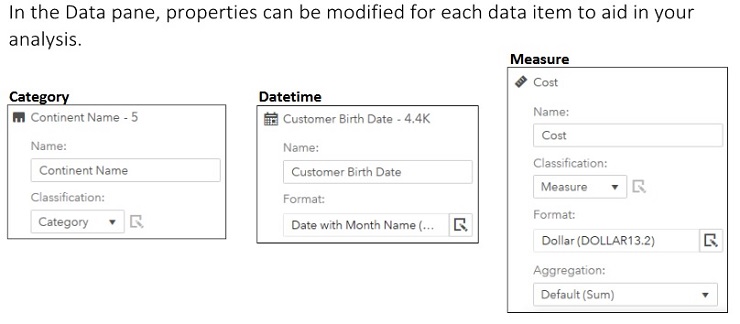
In the Data pane, an icon next to each data item indicates the type of data item. The following types of data items are available:
Category: A data item whose distinct values are used to group and aggregate measures.
Date and Time: A category data item whose distinct values are used to group and aggregate measures. There are three types of date categories: date, datetime, and time.
Custom Category: A data item that can be created based on either a category or numeric data item. A custom category is always a category data item with alphanumeric values.
Calculated (category): A data item that is calculated from existing data items using an expression and returns an alphanumeric value.
Calculated (datetime): A data item that is calculated from existing data items using an expression and returns a datetime value. Calculated dates and times are treated as categories with distinct values being governed by the chosen date or time format.
Geography: A category data item whose values are mapped to geographical locations or regions. These data items can be used to show data on a geographic map.
Hierarchy: A data item with a predefined arrangement of category data items, typically whose values are arranged with more general information at the top and more specific information at the bottom. The first level of the hierarchy is known as the root level.
Geographic Hierarchy: A hierarchy whose members are all geographic data items.
Interaction Effect : A user-created data role that can be used when there is a non-additiverelationship between two variables (the effect of one variable on a model changes as another variable changes). SAS Visual Statistics must be licensed for you to create and use an interaction effect.
Measure: A data item whose values can be used in computations. These values are numeric. By default, almost all measures have a default aggregation of Sum, but the aggregation can be modified.
Calculated (measure): A data item that is calculated from existing data items using an expression and returns a numeric value. Numeric data items are treated as measures (with an aggregation type of Sum), or they can be changed to category data items.
Frequency: A measure data item whose value represents the number of observations in the selected data source. This data item is automatically added to the Data pane under the Measure group. You cannot change the classification for this data item. This data item is automatically assigned to some report objects when no measure is assigned.
Frequency Percent: A measure data item whose value represents the percentage of observations in the selected data source. This data item is automatically added to the Data pane under the Aggregated Measure group. You cannot change the classification for this data item.
Aggregated Measure or Time Period Calculation: A data item that represents special predefined operations, like distinct count, percentage of totals, percentage of subtotals, or frequency percent. Users can also create their own aggregated measure calculations. Aggregated measures cannot be used in all report objects, filters, controls, spark lines, or time series graphs. Some aggregated measures cannot be used in a detail rank. Percentage of subtotal items can be used only in a crosstab.
Working with Data Items
This demonstration illustrates how to modify data item properties (name, format, aggregation) in Visual Analytics.
1.From the browser window, select SAS Drive from the bookmarks bar.
2. If necessary, clickand select New Report in the top left corner of SAS Drive.
3.Click Data.
4.In the Open Data Source window, select Data Sources.
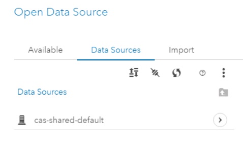
5. Double-click cas-shared-default.
6. Double-click Public PATH.
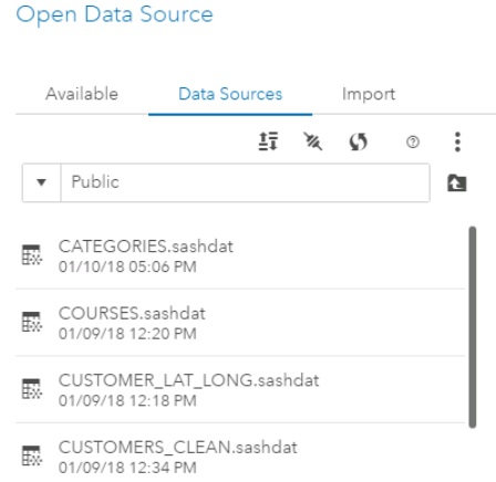
7. SelectCUSTOMERS_CLEAN.Note: If CUSTOMERS_CLEAN does not exist, then right-click CUSTOMERS_CLEAN.sashdatand select Load.
8.ClickOK.The Data pane is displayed, and it contains a list of data items from the CUSTOMERS_CLEANtable.
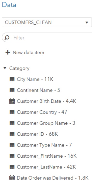
9. If necessary, click the Data icon in the left pane.
10.Verify that Customer ID and Order ID appear in the Category group, because the data type waschanged to character in SAS Data Studio.
Note: Character and datetime data items appear as categories in Visual Analytics.
11.Verify that the new columns created in SAS Data Studio (Customer_FirstName,Customer_LastName, and Title) appear in the Category group.
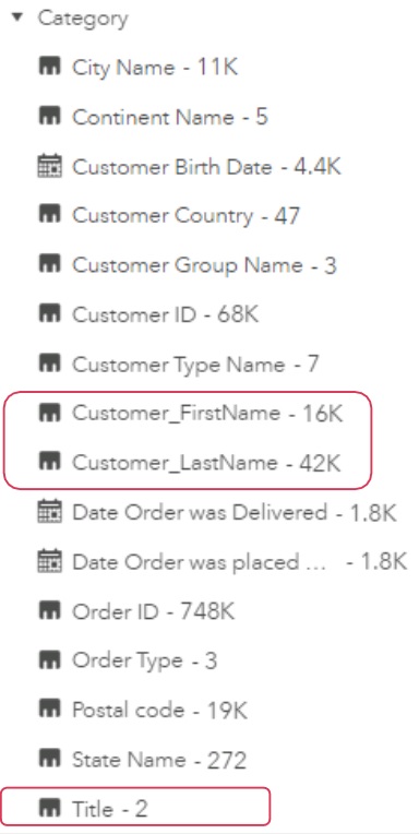
12.Verify that the new columns created in SAS Data Studio (Days to Delivery and Profit) appear inthe Measure group. Note: Numeric (double) data items appear as measures in Visual Analytics
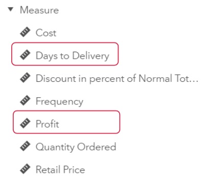
Note: Cost and Retail Price were renamed in SAS Data Studio to Unit Cost and Total Revenue, respectively. Those new names are not reflected because Visual Analytics displays labels, not data source names.
13.Modify properties for a data item, Date Order was Delivered.
- In the Category group, right-click Date Order was Delivered.
- Select Format c:: More formats.
- SelectMMMYYYY.
- ClickOK.
- Click(Edit properties) next to Date Order was Delivered.
- Enter Delivery Date in the Name field and press Enter.
14. Modify properties for a data item,Profit.
- In the Measure group, click(Edit properties) next toProfit.
- Click(Edit) for the Formatfield.
- If needed, change Width to 12.
- If needed, change Decimals to 2.
- Click OK.
15.Modify properties for a data item, Discount in percent of Normal Total Retail Price.
- In the Measure group, click(Edit properties) next to Discount in percent of Normal Total Retail Price.
- Select Average for the Aggregation field.
- Enter Discount in the Name field and click(Edit properties) to collapse the data item.
16.Modify the aggregation for a data item, Days to Delivery.
- In the Measure group, click(Edit properties) next to Days to Delivery.
- Select Average for the Aggregation field.
- Enter Average Days to Delivery in the Name field and click(Edit properties) to collapse the data item
17.Rename data items.
- In the Category group, click(Edit properties) next to Date Order was placed by Customer.
- Enter Order Date in the Name field and click(Edit properties) to collapse the data item.
- In the Measure group, click(Edit properties) next toCost.
- Enter Unit Cost in the Name field and click(Edit properties) to collapse the data item.
- In the Measure group, click(Edit properties) next to Quantity Ordered. f.Enter Quantity in the Name field and click(Edit properties) to collapse the data item.
- In the Measure group, click(Edit properties) next to Retail Price.
- Enter Total Revenue in the Name field and click(Edit properties) to collapse the data item.
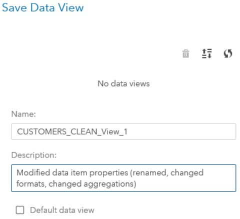
18.Create a data view.
- Click(Actions) and selectSave data view.
- Verify that CUSTOMER_CLEAN_View_1 appears in the Namefield.
- Enter Modified data item properties (renamed, changed formats, changed aggregations) in the Description field.
- Click Save.
19.Save the report.
- In the upper right corner, click(Menu) and select Save as.
- Navigate to the Content>>Courses>>YVA183>>Basics>>Demosfolder.
- EnterVA1- Demo3.1 in the Name field.
- Click Save.
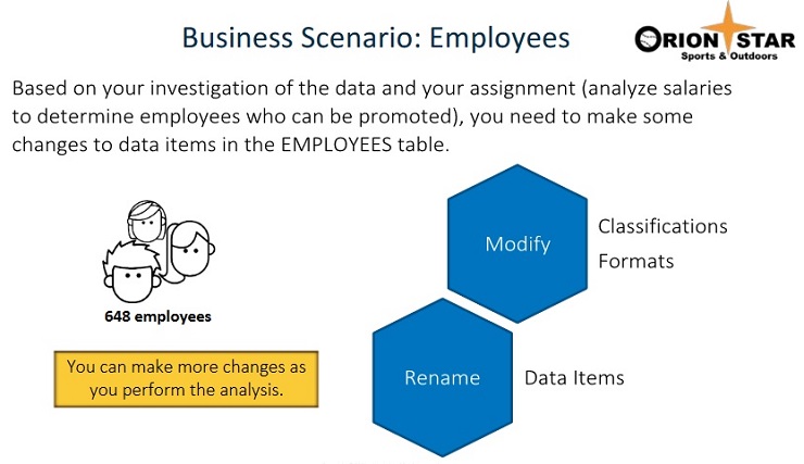
Business Scenario: Employees
Exercise
1.Working with Data Items
- Open the browser and sign in to Visual Analytics using Eric’s credentials.
- Open the VA1- Exercise3.1 report from the Content>>Courses>>YVA183>>Basics>>Exercises (HR) folder.
- View the data items in the Data pane and answer the following questions:What is the classification of Employee ID? Manager at 1. level?Answer:What does the Frequency data item represent?Answer:
- Change the classification for Manager at 1. level to Category.
- Change the format for Annual Salary to Dollar13.2.
- Rename the following data items: Old
|
Old name |
New name |
|
Employee ID |
ID |
|
Employee Name |
Name |
|
Manager at 1. level |
Manager ID |
|
Frequency |
Number of Employees |
Exploring Data with Charts and Graphs
Objectives
Discuss when to use descriptive graphs (histogram, box plot, bar chart) in Visual Analytics.
Maximize graphs objects to view details. • Modify roles and options for graph objects.
Co p yrigh t © SAS In sti tu te In c. All righ ts reserved .
Objects: Graphs (Descriptive)
|
Histogram Box plot |
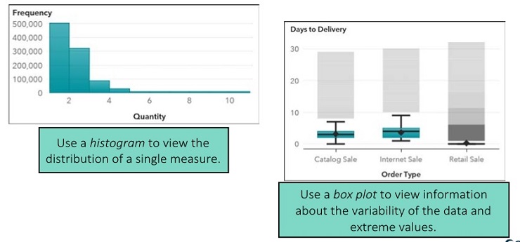
The histogram contains a series of bars that represent the number of observations (or percentage of all observations) for a measure that fit in a specified value range (or bin). The shape of the distribution can be affected by the number of bins specified for the histogram. Note: If you use the default number of bins, then the minimum and maximum values on the histogram might not match your actual data values. However, if you specify the number of histogram bins, then the minimum and maximum values on the histogram match your actual data values exactly. |
|
The size and location of the box indicate the range of values between the 25th and 75th percentile (or the interquartile range). The diamond marker inside the box indicates the mean value, and the line inside the box indicates the median value. You can modify options to display outliers in the plot. Outliers are data points whose distance from the interquartile range are more than 1.5 times the size of the interquartile range. The whiskers (lines protruding from the box) can indicate either minimum and maximum values of the plot or the range of values outside of the interquartile range but close enough not to be considered outliers. If there are a large number of outliers, the range of outlier values is represented by a bar colored to represent the number of values inside the outlier range (as seen above). |
|
Bar chart |
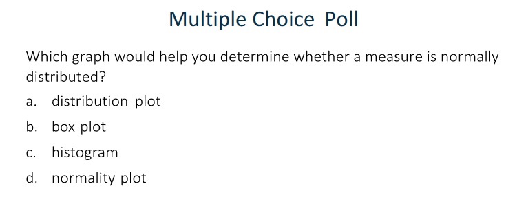
A bar chart displays data aggregated by the distinct values of a category. By default, the bars are sorted by descending order of the value of the first measure. For ranked bars, the data is sorted based on the values of the rank. Stacked bar charts enable you to compare totals for each category, as well as totals for all categories. However, comparing segments is difficult, and when there are many segments in the chart, it is difficult to read. To see relative differences (parts of a whole) in a bar chart, select Normalize groups to 100% for the Group scale option. Note: Nominal values are categories whose data has no particular order. |
Exploring Data: Part 1
This demonstration illustrates how to use the automatic chart to explore data and modify roles and options for charts and graphs in Visual Analytics.
- From the browser window, select SAS Drive from the bookmarks bar.
- Click the New Report button in the top left corner of SAS Drive.
The Welcome to SAS Visual Analytics window appears.
- Click Open.
- Navigate to the Content>>Courses>>YVA183>>Basics>>Demos (Marketing)
- Double-click VA1- Demo3.2a to open the report.
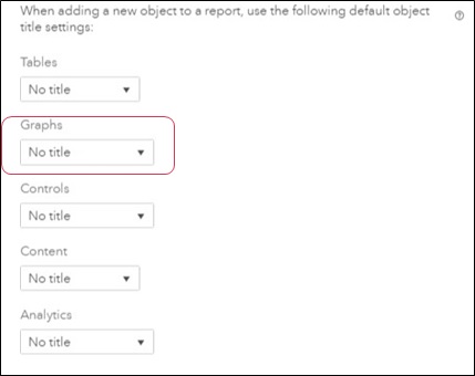
- Turn off automatic graph titles.
- In the upper right corner, select Eric c:: Settings.
- Select General under SAS Visual Analytics on the left side of the window.
- Scroll down to When adding a new object to a report, use the following default object title settings.
- For Graphs, change Automatic title to No title.
- Click Close.
- Create an automatic chart.
- In the left pane, click the Data
- Drag Profit from the Data pane to the canvas.
The automatic chart functionality determines the best way to display the selected data.
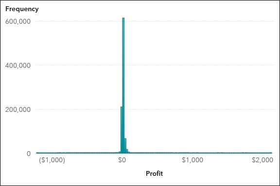
- histogram is used to display the distribution of profits.
- If necessary, click the Roles icon in the right pane.
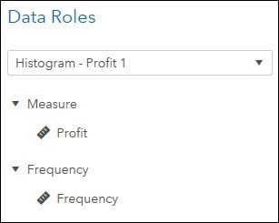
- histogram accepts two roles, Measure and Frequency.
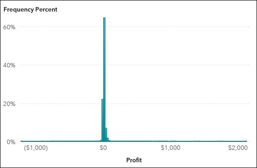
- For the Frequency role, select Frequency c:> Frequency Percent. The histogram is updated to use frequency percent for the Y axis.
- In the right pane, click the Options 1) Expand the Object group.
2) Enter Distribution of Profit in the Name field.
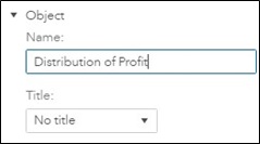
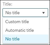
Note: The Automatic title setting was turned off for Graph objects in an earlier demo. You can turn it on for this graph by selecting Automatic title, or you can create a custom title by selecting Custom title.
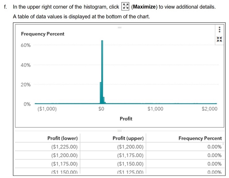
- Click the highest bar in the graph.
- Scroll through the table to find the highlighted row.

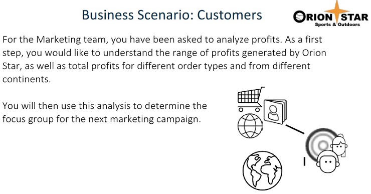
A majority of the products ordered are low profit items, in the $0 to $25 range. Also notice that a little more than 20% of items result in a loss. Why is this problem occurring? Are these products ordered from a similar product area, geographical area, or order type? Could the costs be too high in these areas? What can we do to reduce costs?
- In the upper right corner, click (Restore).
- Create a crosstab.
- In the left pane, click the Objects
- Drag the Crosstab object, from the Tables group, to the bottom of the canvas.
- In the right pane, click the Roles
- For the Rows role, select Add c:> Order Type and click OK.
- For the Measures role, select Frequency c:>
Profti. The Roles pane should resemble the following:
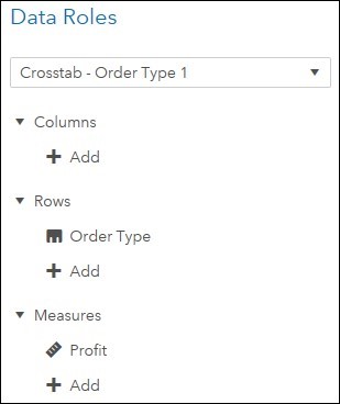
Note: The Measures role is required for the crosstab object. The crosstab should resemble the following:
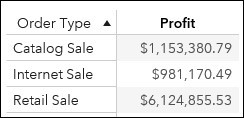
Profits are much lower in the internet and catalog channels. A company-wide policy mandates that we need to try to improve profits for orders through these channels.
- On the Roles tab, for the Columns role, select Add c:> Continent Name and click OK. The updated crosstab should resemble the following:

- In the right pane, click the Options
- Expand the Totals and Subtotals
- Select the Totals check box.
By default, totals are added to rows and columns.
The updated crosstab should resemble the following:
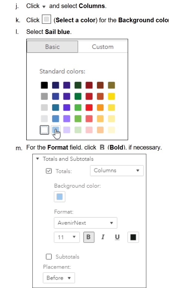
The updated crosstab should resemble the following:

Profits are much lower in North America than in Europe. Because our corporate office is located in North America, we would expect higher profits. Also notice the loss in Africa for internet sales. Why is this loss occurring? Is this due to start-up operations (for example, building distribution facilities in Africa)? Are the losses consistent over time or has this changed over time?
- Change the crosstab to a bar chart.
- In the upper right corner of the crosstab, click (More) and select Change Crosstab to c:: Bar Chart.
The bar chart should resemble the following:
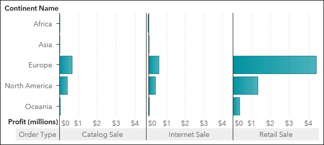
- In the right pane, click the Roles
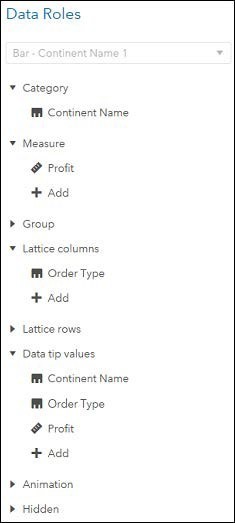
The bar chart has many more roles available.
- Category data items can be added to the Group role to show additional bars for each category, or to the Lattice columns and Lattice rows roles to add additional bar charts for each distinct category.
- Category and Measure data items can be added to the Data tip values role to show additional information when a bar is selected.
- Datetime data items can be added to the Animation role to animate the bar chart.
- Category or date data items can be added to the Hidden role for mapping data sources, adding color-mapped display rules, or adding external links.
- Drag Order Type, from the Lattice columns role, to the Group role. The bar chart should resemble the following:
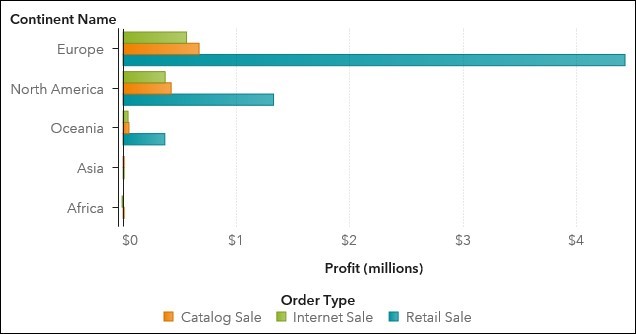
- In the right pane, click the Options
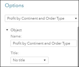
- Expand the Object
- Enter Profit by Continent and Order Type in the Name
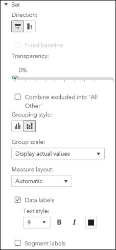
- In the Bar group, for the Grouping style field, click (Stacked).
- Select Data labels.
- Select 9 for the Text style
The Options pane should resemble the following:
The updated bar chart should resemble the following:
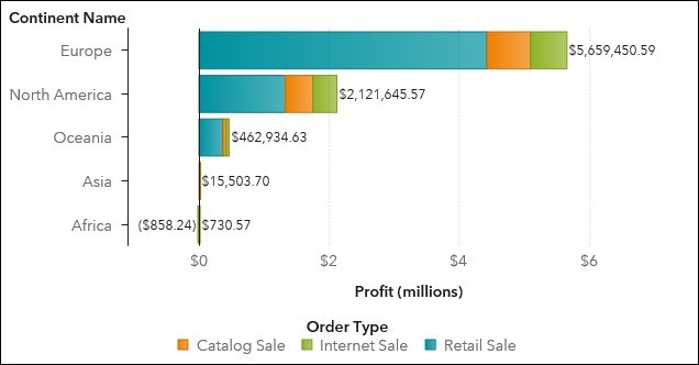
Profits in North America are less than half of total profits in Europe. We need to understand why this discrepancy exists and try to improve profits in non-European countries.
- In the left pane, click the Outline icon.
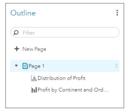
The Outline pane displays a list of all pages and objects in the report.
- In the upper right corner, click(Menu) and select Save.
- Select Your Email:: Sign Out in the upper right corner to sign out.
Exercise
- Exploring Data: Part 1
- Open the browser and sign in to Visual Analytics using Eric’s credentials.
- Open the VA1- Exercise3.2a report from the Content>>Courses>>YVA183>>Basics>>Exercises(HR) folder.
- Create an automatic chart using the following data items:
Annual Salary
Frequency Percent
- Modify the following options for the automatic chart:
|
Name |
Distribution of Salary |
|
Bin range |
Measure values |
|
Set a fixed bin count |
<selected> |
|
Bin count |
4 |
The automatic chart should resemble the following:
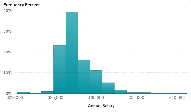
e. Maximize the histogram to answer the following question: Into which range do a majority of salaries fall?
Hint: After answering the question, click (Restore) in the upper right corner.
f. Add a bar chart on the right of the automatic chart by assigning the following data items to the specified roles:
|
Category |
Job Title |
|
Measure |
Annual Salary |
|
Group |
Department |
g. Specify Total Salary by Job and Department as the name of the bar chart. The bar chart should resemble the following:
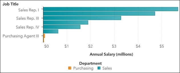
h. Answer the following questions: In which department are a majority of our salary costs spent? For which job title?
Answer:
Why do you think salary costs are so much higher for this group?
Answer:
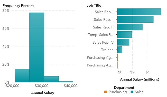
The final report should resemble the following:
i. Save the report.
j. Sign out of Visual Analytics.
Exploring Data: Part 2
This demonstration illustrates how to use box plots to explore data in Visual Analytics.
- From the browser window, select SAS Drive from the bookmarks bar.
- Click the New Report button in the top left corner of SAS Drive.
The Welcome to SAS Visual Analytics window appears.
- Click Open.
- Navigate to the Shared Data/Basics/Demos (Marketing)
- Double-click VA1- Demo3.2b to open the report.
- In the upper left corner of the report, click the Page 2
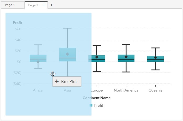
- Create a box plot.
- In the left pane, click the Objects
- Drag the Box Plot object, from the Graphs group, to the left side of the canvas.
c. In the right pane, click the Roles icon.
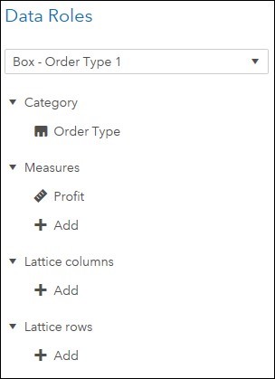
d. For the Category role, select Add Order Type.
e. For the Measures role, select Add Profit and click OK.
The Roles pane should resemble the following:
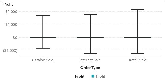
The box plot should resemble the following:
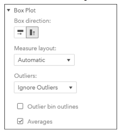
f. In the right pane, click the Options icon.
g. If necessary, expand the Object section.
h. Enter Profit by Order Type in the Name field.
i. In the Box Plot group, select Ignore Outliers for the Outliers field.
j. Select the check box for Averages.
The box plot should resemble the following:
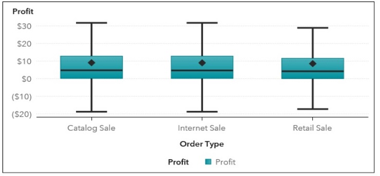
k.In the upper right corner of the box plot, click(Maximize) to view additional details. The table of data values displays descriptive statistics for Profit for each order type.

Even though total profits are highest for the retail sales channel, averages across all channels are very similar, but are a bit higher for catalog and internet sales. This reinforces our company-wide policy to try to increase profits in these channels. Total profits might be higher in retail because there are more customers or more orders for that channel.
l. In the upper right corner, click (Restore).
m. In the upper right corner of the Profit by Continent box plot, click (Maximize) to view additional details. The table of data values displays descriptive statistics for Profit for each continent.

Even though total profits are highest for Europe, averages are higher in North America and Asia. Because our corporate office is located in North America, we will start by focusing on increasing profits in North America. Total profits might be higher in Europe because there are more customers or more orders for that continent. Also, note the negative average profits in Africa. Why is this occurring? What can we do to increase profits for that continent?
n. In the upper right corner, click (Restore).
9. In the upper right corner, click (Menu) and select Save.
10. Select Email Sign Out in the upper right corner to sign out.
3. Exploring Data: Part 2
a. Open the browser and sign in to Visual Analytics using Erics credentials.
b. Open the VA1- Exercise3.2b report from the Shared Data/Basics/Exercises (HR)folder.
c. On Page 2, create a box plot by assigning the following data items to the specified roles:
|
Category Measures |
Job Title |
|
Annual Salary |
d. Modify the following options for the box plot:
|
Name |
Salary Analysis by Job Title |
|
Outliers |
Show Outliers |
|
Show averages |
<selected> |
The box plot should resemble the following:
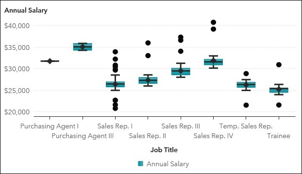
e. Maximize the box plot to answer the following questions:
Which job title has the highest average salary? The lowest?
Answer:
Orion Star has had a great sales year and would like to promote some employees. With which job title would you recommend starting the promotion analysis? Why?
Answer:
Hint: After answering the question, click (Restore) in the upper right corner. f. Save the report.
g. Sign out of Visual Analytics.
Diploma Universities Assignments
Laureate International Universities Assignment
Holmes Institute Assignment
Tafe NSW
Yes College Australia
ACC508 Informatics and Financial Applications Task 2 T2, 2019
ACC512 Accounting
ACC520 Legal Regulation of Business Structures Semester 2, 2019
ACCT20074 Contemporary Accounting Theory Term 2 Assessment 3
AERO2463 Computational Engineering Analysis : Assignment 4
B01DBFN212 Database Fundamentals Assessment 1
BE01106 - Business Statistics Assignment
BFA301 Advanced Financial Accounting
BFA504 Accounting Systems Assessment 3
BSB61015 Advanced Diploma of Leadership and Management
BSBADV602 Develop an Advertising Campaign
BSBCOM603 Plan and establish compliance management systems case study
BSBCOM603 Plan and establish compliance management systems Assessment Task 1
BSBCOM603 Plan and establish compliance management systems Assessment Task 2
BSBCOM603 Plan and establish compliance management systems Assessment Task 3
BSBFIM501 Manage Budgets And Financial Plans Assessment Task 1
BSBHRM602 Manage Human Resources Strategic Planning
BSBINM601 Manage Knowledge and Information
BSBWOR501 Assessment Task 3 Plan Personal Development Plan Project
BSBMGT517 Manage Operational Plan
BSBWHS521 Ensure a Safe Workplace For a Work Area
BSBWRK510 Manage employee relations
BUSS1030 Accounting, Business and Society
CAB202 Microprocessors and Digital Systems Assignment Help
CHC40213 Certificate IV in Education Support
CHCAGE001 Facilitate the empowerment of older people
CHCAGE005 Provide support to people living with dementia
CHCCCS023 Support independence and wellbeing
CHCCCS025 Support relationships with carers and families
CHCCOM005 Communicate and CHCLEG001 Work Legally Ethically
CHCDIS002 Follow established person-centred behaviour supports
CHCECE019 Early Childhood Education and Care
CHCHCS001 Provide home and community support services
COMP10002 Foundations of Algorithms
COMP90038 Algorithms and Complexity
COSC2633/2637 Big Data Processing
COSC473 Introduction to Computer Systems
CPCCBC5011A Manage Environmental Management Practices And Processes In Building And Construction
CPCCBC5018A Apply structural Principles Medium rise Construction
CSE3OSA Assignment 2019
ELEC242 2019 Session 2
ENN543 Data Analytics and Optimisation
ENN543 Data Analytics and Optimisation Semester 2, 2019
FINM202 Financial Management Assessment 3 Group Report
Forensic Investigation Case Assignment ECU University
HA2042 Accounting Information Systems T2 2019
HC1010 Holmes Institute Accounting For Business
HC2112 Service Marketing and Relationship Marketing Individual Assignment T2 2019
HC2121 Comparative Business Ethics & Social Responsibility T2 2019
HI5002 Holmes Institute Finance for Business
HI5003 Economics for Business Trimester 2 2019
HI5004 Marketing Management T1 2020 Individual Report
HI5004 Marketing Management T1 2020 Group Report
HI5004 Holmes Institute Marketing Management
HI5014 International Business across Borders Assignment 1
HI5014 International Business across Borders
HI5017 Managerial Accounting T2 2019
HI5017 Managerial Accounting T1 2019
HI5019 Tutorial Questions 1
HI5019 Strategic Information Systems for Business and Enterprise T1 2020
HI5019 Holmes Institute Strategic Information Systems T2
HI5019 T2 2019
HI5019 T1 2019
HI5020 Corporate Accounting T3 2019
HI5020 Corporate Accounting T2 2019
HI6005: Management and Organisations in a Global Environment
HI6006 Tutorial questions
HI6006 Competitive Strategy Individual T1 2020
HI6006 Holmes Institute Competitive Strategy
HI6006 Competitive Strategy T3 2019
HI6007 Statistics for business decisions
HI6007 Assessment 2 T1 2020
HI6007 T1 2019
HI6008 T2 2019
HI6008 Holmes Institute Research Project
HI6025 Accounting Theory and Current Issues
HI6026 Audit, Assurance and Compliance Assignment Help
HI6026 Audit, Assurance and Compliance
HI6027 business and corporate law tutorial Assignment T1 2021
HI6027 Business and Corporate Law T3 2019
HI6027 Business and Corporate Law T2 2019
HI6028 Taxation Theory, Practice and Law T2 2021
Hi6028 taxation theory, practice and law Final Assessment t1 2021
HI6028 Taxation Theory, Practice and Law T2 2019
HI6028 Taxation Theory T1 2019
HI6028 Taxation Law Holmes
HLTAAP001 Recognise healthy body systems
HLTWHS002 Follow safe practices for direct client care
HOTL5003 Hotel Property and Operations
HPS771 - Research Methods in Psychology A
HS2021 Database Design
ICTICT307 Customise packaged software applications for clients
IFN619 Data Analytics for Strategic Decision Makers
INF80028 Business Process Management Swinburne University
ISY2005 Case Assignment Assessment 2
ISYS326: Information Systems Security Assignment 2, Semester 2, 2019
ITAP3010 Developing Data Access Solutions Project
ITECH1103- Big Data and Analytics – Lab 3 – Working with Data Items
ITECH1103- Big Data and Analytics Assignment Semester 1, 2020
ITECH 5500 Professional Research and Communication
Kent Institute Australia Assignment
MA5830 Data Visualisation Assignment 2
MGMT7020 Project Management Plan
Mgt 301 Assessment 3
MGT215 Project Management Individual Assignment
MIS102 Data and Networking Assignment Help
MITS4002 Object Oriented Software Development
MITS5002 Software Engineering Methodology
MKT01760 Tourism Planning Environments Assessment 4
MKT01760 Tourism Planning Environments
MKT01906 International Tourism Systems
MKT5000 Marketing Management S2 2019
MNG03236 Report Writing SCU
MRE5003 Industrial Techniques In Maintenance Management Assignment 4
MRE5003 Industrial Techniques In Maintenance Management Assignment 3
MRE5003 Industrial Techniques In Maintenance Management
Network Security and Mitigation Strategies Answers
NIT2213 Software Engineering Assignment
NSB231 Integrated Nursing Practice Assessment Task 1
Science Literacy Assessment 4
SIT323 Practical Software Development T 2, 2019
SIT718 Using aggregation functions for data analysis
SITXCOM002 Show Social and Cultural Sensitivity
TLIL5055 Manage a supply chain
TLIR5014 Manage Suppliers
USQ ACC5502 Accounting and Financial Management
UTS: 48370 Road and Transport Engineering Assessment 2
CHCAGE001 Facilitate the empowerment of older people
CHCAGE005 Provide support to people living with dementia
CHCCCS011 Meet personal support needs
CHCCCS015 Provide Individualised Support
CHCCCS023 Support independence and wellbeing
CHCCCS025 Support relationships with carers and families
CHCCOM005 Communicate and work in health or community services
CHCDIS001 Contribute to ongoing skills development
CHCDIS002 Follow established person-centred behaviour supports
CHCDIS003 Support community participation and social inclusion
CHCDIS005 Develop and provide person-centred service responses
CHCDIS007 Facilitate the empowerment of people with disability
CHCDIS008 Facilitate community participation and social inclusion
CHCDIS009 Facilitate ongoing skills development
CHCDIS010 Provide person-centred services
CHCDIV001 Work with diverse people
CHCHCS001 Provide home and community support services
CHCLEG001 Work legally and ethically
CHCLEG003 Manage legal and ethical compliance
HLTAAP001 Recognise healthy body systems
HLTAID003 Provide First Aid
HLTHPS007 Administer and monitor medications
HLTWHS002 Follow safe work practices for direct client care
Assignment 2 Introduction to Digital Forensics
MGT603 Systems Thinking Assessment 1
MGT603 Systems Thinking Assessment 2
Hi5017 Managerial Accounting T1 2021
HI6028 Taxation Theory, Practice and Law T1 2021
OODP101 Assessment Task 3 T1 2021
ITNE2003R Network Configuration and Management Project
Australia Universities
ACT
Australian Catholic University
Australian National University
Bond University
Central Queensland University
Charles Darwin University
Charles Sturt University
Curtin University of Technology
Deakin University
Edith Cowan University
Flinders University
Griffith University
Holmes Institute
James Cook University
La Trobe University
Macquarie University
Monash University
Murdoch University
Queensland University of Technology
RMIT University
Southern Cross University
Swinburne University of Technology
University of Adelaide
University of Ballarat
University of Canberra
University of Melbourne
University of Newcastle
University of New England
University of New South Wales
University of Notre Dame Australia
University of Queensland
University of South Australia
University of Southern Queensland
University of Sydney
University of Tasmania
University of Technology Sydney
University of the Sunshine Coast
University of Western Australia
University of Wollongong
Victoria University
Western Sydney University
Year 11 - 12 Certification Assignment
Australian Capital Territory Year 12 Certificate
HSC - Higher School Certificate
NTCE - Northern Territory Certificate of Education
QCE - Queensland Certificate of Education
SACE - South Australian Certificate of Education
TCE - Tasmanian Certificate of Education
VCE - Victorian Certificate of Education
WACE - Western Australia Certificate of Education
Assignment Service Australia | CDR Writing Help | TAFE Assignment Help | Perth Assignment Help | Melbourne Assignment Help | Darwin Assignment Help | Adelaide Assignment Help | Assignment Help Victoria | Sydney Assignment Help | Canberra Assignment Help | Brisbane Assignment Help | CDR for Australian immigration | Course For Australian History


